// FITNESS · MELBOURNE
CONCEPT
RAW
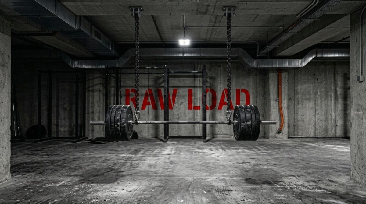
RAW
LOAD.
CONCEPT STUDY. RAW LOAD is a designed brand, not a real client. The work shown is a demonstration of how we'd build identity for a brutalist fitness studio.
A strength facility for people who train like they mean it. Concrete, steel, no decoration, no apologies.